7. Modeling Non-linear Pricing Elasiticity
The pricing elasticity curve, defined as
demand/quantity (y-axis) versus
price (x-axis),
is often modeled using linear models. However, we sometime observe that the pricing elasticity curve is curvilinear; namely, there is an exponential decay between quantity and price; as price goes up, quantity decays exponentially. Let’s see how we can model the exponential decay relationship.
7.1. Simulate price vs quantity
The exponential decay model is defined as follows.
\(N(t) = N_0 e^{-\lambda t}\)
Where,
\(t\) is time,
\(N_0\) is the starting amount at time zero, and
\(\lambda\) is the decay rate.
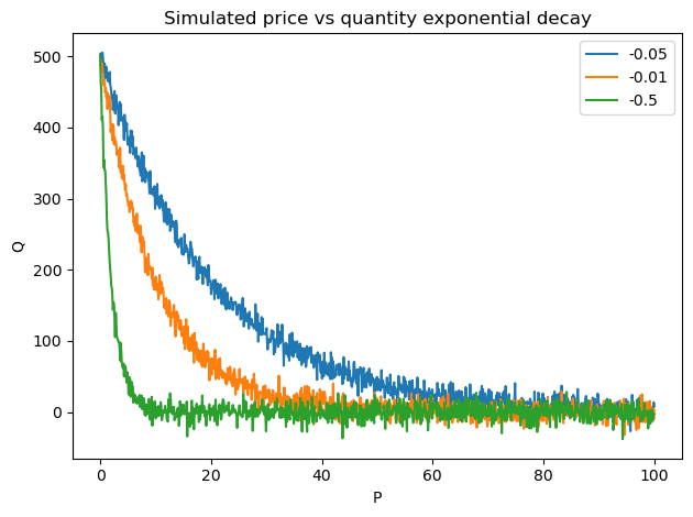
We will generate an exponential decay relationships between price and quantity. Below, we show some simulations where we add Gaussian noise.
[1]:
import numpy as np
import pandas as pd
import matplotlib.pyplot as plt

np.random.seed(37)

def get_elasticity_curve(N_0=1, decay_rate=-0.05, n=1_000, start=0, end=100, std=0.01):
    x = np.linspace(start, end, n)
    y = (N_0 * np.exp(decay_rate * x)) + np.random.normal(0, std, len(x))

    return pd.Series(y, x)

fig, ax = plt.subplots()

get_elasticity_curve(N_0=500, decay_rate=-0.05, std=10).plot(kind='line', ax=ax, label='-0.05')
get_elasticity_curve(N_0=500, decay_rate=-0.1, std=10).plot(kind='line', ax=ax, label='-0.01')
get_elasticity_curve(N_0=500, decay_rate=-0.5, std=10).plot(kind='line', ax=ax, label='-0.5')

ax.set_xlabel('P')
ax.set_ylabel('Q')
ax.set_title('Simulated price vs quantity exponential decay')

ax.legend()

fig.tight_layout()
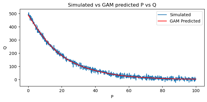
7.2. Model price vs quantity
Let’s simulate a single elasticity curve with an exponential decay relationship between price and quantity. We will then use GAM to model the relationship between \(P\) and \(Q\).
[2]:
from pygam import LinearGAM, s, f

def get_elasticity_curve_df(N_0=1, decay_rate=-0.05, n=1_000, start=0, end=100, std=0.01):
    return get_elasticity_curve(N_0, decay_rate, n, start, end, std) \
        .to_frame() \
        .reset_index() \
        .rename(columns={
            'index': 'P',
            0: 'Q'
        })

Xy = get_elasticity_curve_df(N_0=500, std=10)
X = Xy[['P']]
y = Xy['Q']

pq_model = LinearGAM(s(0, n_splines=10)).fit(X, y)
pq_df = X.assign(Q=pq_model.predict(X))
You can see below that GAM does a very good job at smoothing the noisy relationship.
[3]:
fig, ax = plt.subplots(figsize=(7, 3.5))

Xy.plot(kind='line', x='P', y='Q', ax=ax, label='Simulated')
pq_df.plot(kind='line', x='P', y='Q', ylabel='Q', ax=ax, label='GAM Predicted', color='red')

ax.set_title('Simulated vs GAM predicted P vs Q')

fig.tight_layout()
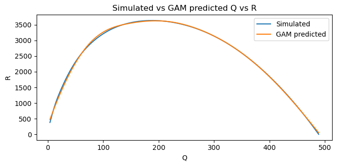
7.3. Model quantity vs revenue
The revenue, \(R\), is defined as \(R = PQ\). We will use GAM to model the relationship between \(Q\) and \(R\).
[4]:
Xy = pq_df.assign(R=lambda d: d['P'] * d['Q'])

X = Xy[['Q']]
y = Xy['R']

qr_model = LinearGAM(s(0, n_splines=10)).fit(X, y)
pqr_df = pq_df.assign(R=lambda d: qr_model.predict(d[['Q']]))
[5]:
fig, ax = plt.subplots(figsize=(7, 3.5))

Xy.plot(kind='line', x='Q', y='R', ax=ax, label='Simulated')
pqr_df.plot(kind='line', x='Q', y='R', ylabel='R', ax=ax, label='GAM predicted')

ax.set_title('Simulated vs GAM predicted Q vs R')

fig.tight_layout()
7.4. Marginal revenue
The marginal revenue, \(R'\), is defined as follows.
\(R' = \dfrac{\mathrm{d} R}{\mathrm{d} Q}\)
In the linear model, we can analytically solve for \(R'\) (also denoted as, MR). With a non-linear relationship, especially using GAM, we need to use numerical methods to estimate \(R'\). Here, we use numdifftools.
[6]:
%%time

import numdifftools as nd

dfun = nd.Gradient(lambda Q: qr_model.predict(pd.DataFrame(Q.reshape(-1,1), columns=['Q'])))
mr = np.array([dfun(v) for v in pqr_df['Q'].values])
pqrr_df = pqr_df.assign(MR=mr)
CPU times: user 10.3 s, sys: 22.1 ms, total: 10.4 s
Wall time: 9.99 s
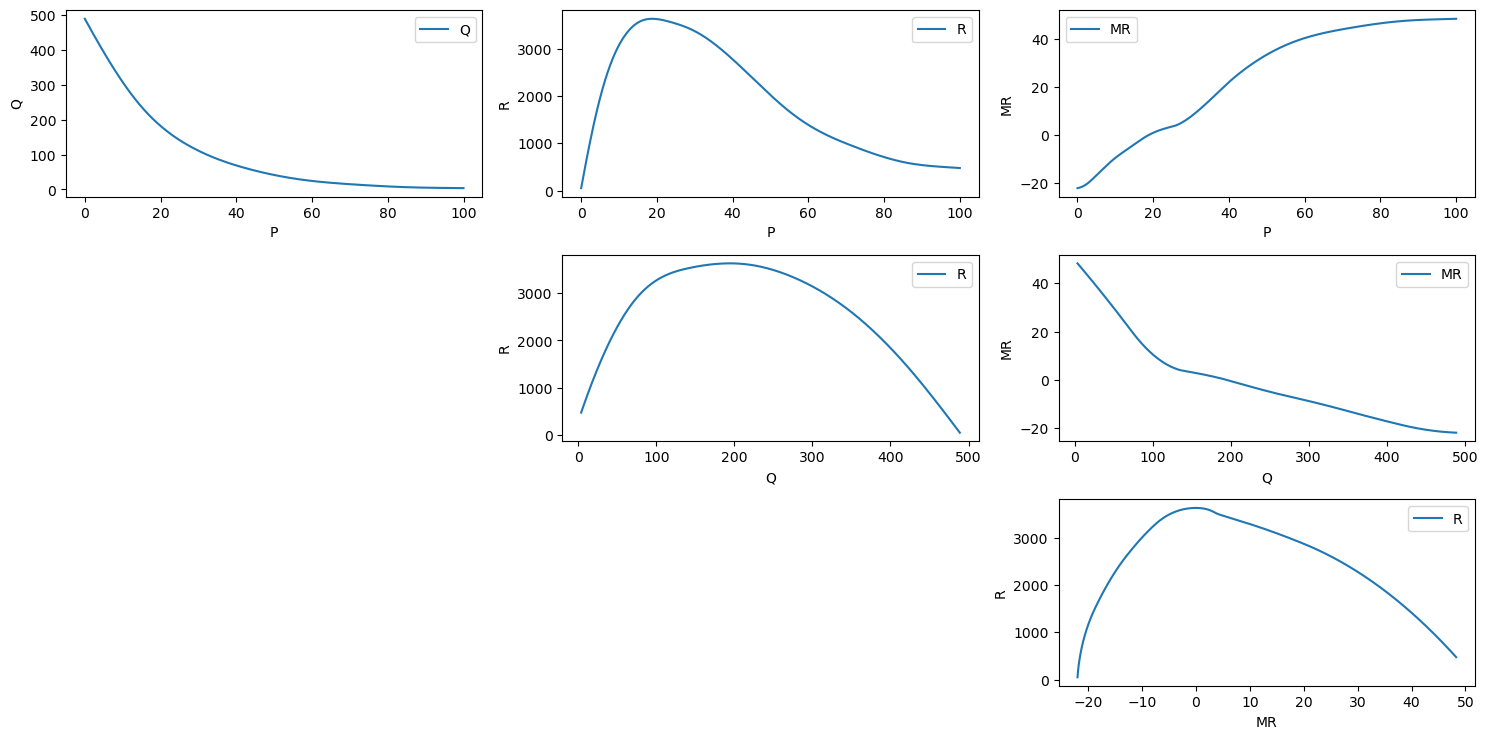
Now we can plot \(P, Q, R\) and \(R'\).
As \(P\) goes up, \(Q\) goes down
As \(P\) goes up, \(R\) goes up and then down
As \(P\) goes up, \(R'\) goes up
As \(Q\) goes up, \(R\) goes up and then down
As \(Q\) goes up, \(R'\) goes down
As \(R'\) goes up, \(R\) goes up and then down
[7]:
fig, axes = plt.subplots(3, 3, figsize=(15, 7.5))
axes = np.ravel(axes)

pqrr_df.plot(kind='line', x='P', y='Q', ylabel='Q', ax=axes[0])
pqrr_df.plot(kind='line', x='P', y='R', ylabel='R', ax=axes[1])
pqrr_df.plot(kind='line', x='P', y='MR', ylabel='MR', ax=axes[2])
axes[3].axis('off')
pqrr_df.plot(kind='line', x='Q', y='R', ylabel='R', ax=axes[4])
pqrr_df.plot(kind='line', x='Q', y='MR', ylabel='MR', ax=axes[5])
axes[6].axis('off')
axes[7].axis('off')
pqrr_df.plot(kind='line', x='MR', y='R', ylabel='R', ax=axes[8])

fig.tight_layout()
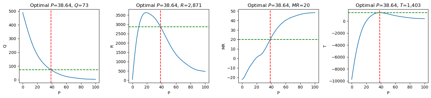
7.5. Optimal price
The optimal \(R'\) is found when it is equal to the marginal cost, \(C'\) (or MC). Let’s say \(C'\) is given as 20, then we can find the closest matching \(R'\) and simply lookup the corresponding \(R, Q,\) and \(P\). According to the calculations, the optimal \(P\) is 38.63, expected to sell \(Q=73\) units, with a revenue of \(R=2,870.97\).
[8]:
pqrr_df \
    .assign(MC=20) \
    .assign(diff=lambda d: np.abs(d['MC'] - d['MR'])) \
    .sort_values(['diff']) \
    .head(5)
[8]:
| P | Q | R | MR | MC | diff | |
|---|---|---|---|---|---|---|
| 386 | 38.638639 | 73.383914 | 2870.970368 | 20.016115 | 20 | 0.016115 |
| 385 | 38.538539 | 73.735715 | 2877.985594 | 19.865738 | 20 | 0.134262 |
| 387 | 38.738739 | 73.033705 | 2863.934233 | 20.166475 | 20 | 0.166475 |
| 384 | 38.438438 | 74.089122 | 2884.979680 | 19.715358 | 20 | 0.284642 |
| 388 | 38.838839 | 72.685076 | 2856.877481 | 20.316345 | 20 | 0.316345 |
Define the total cost as \(C = C'Q\), then the profit, \(T\) is defined as \(T= PQ - C'Q\).
[9]:
pqrr_df \
    .assign(MC=20) \
    .assign(diff=lambda d: np.abs(d['MC'] - d['MR'])) \
    .sort_values(['diff']) \
    .assign(C=lambda d: d['MC'] * d['Q']) \
    .assign(T=lambda d: d['R'] - d['C']) \
    .drop(columns=['diff']) \
    .head(5)
[9]:
| P | Q | R | MR | MC | C | T | |
|---|---|---|---|---|---|---|---|
| 386 | 38.638639 | 73.383914 | 2870.970368 | 20.016115 | 20 | 1467.678282 | 1403.292086 |
| 385 | 38.538539 | 73.735715 | 2877.985594 | 19.865738 | 20 | 1474.714310 | 1403.271284 |
| 387 | 38.738739 | 73.033705 | 2863.934233 | 20.166475 | 20 | 1460.674101 | 1403.260132 |
| 384 | 38.438438 | 74.089122 | 2884.979680 | 19.715358 | 20 | 1481.782437 | 1403.197243 |
| 388 | 38.838839 | 72.685076 | 2856.877481 | 20.316345 | 20 | 1453.701513 | 1403.175967 |
[10]:
pqrct_df = pqrr_df \
    .assign(MC=20) \
    .assign(C=lambda d: d['MC'] * d['Q']) \
    .assign(T=lambda d: d['R'] - d['C'])
pqrct_df
[10]:
| P | Q | R | MR | MC | C | T | |
|---|---|---|---|---|---|---|---|
| 0 | 0.0000 | 488.882022 | 50.394511 | -21.968368 | 20 | 9777.640441 | -9727.245930 |
| 1 | 0.1001 | 486.895001 | 94.018082 | -21.939546 | 20 | 9737.900029 | -9643.881947 |
| 2 | 0.2002 | 484.910265 | 137.530696 | -21.907096 | 20 | 9698.205305 | -9560.674609 |
| 3 | 0.3003 | 482.927849 | 180.924531 | -21.871031 | 20 | 9658.556983 | -9477.632452 |
| 4 | 0.4004 | 480.947789 | 224.191824 | -21.831366 | 20 | 9618.955777 | -9394.763953 |
| ... | ... | ... | ... | ... | ... | ... | ... |
| 995 | 99.5996 | 3.832953 | 477.329433 | 48.253121 | 20 | 76.659067 | 400.670366 |
| 996 | 99.6997 | 3.821495 | 476.776521 | 48.257495 | 20 | 76.429906 | 400.346615 |
| 997 | 99.7998 | 3.809963 | 476.219975 | 48.261897 | 20 | 76.199260 | 400.020715 |
| 998 | 99.8999 | 3.798353 | 475.659636 | 48.266329 | 20 | 75.967063 | 399.692573 |
| 999 | 100.0000 | 3.786662 | 475.095342 | 48.270791 | 20 | 75.733249 | 399.362094 |
1000 rows × 7 columns
[11]:
opt_s = pqrr_df \
    .assign(MC=20) \
    .assign(C=lambda d: d['MC'] * d['Q']) \
    .assign(T=lambda d: d['R'] - d['C']) \
    .assign(diff=lambda d: np.abs(d['MC'] - d['MR'])) \
    .sort_values(['diff']) \
    .head(1) \
    .iloc[0]
opt_s
[11]:
P         38.638639
Q         73.383914
R       2870.970368
MR        20.016115
MC        20.000000
C       1467.678282
T       1403.292086
diff       0.016115
Name: 386, dtype: float64
[12]:
fig, ax = plt.subplots(1, 4, figsize=(15, 3.5))

for y, _ax in zip(['Q', 'R', 'MR', 'T'], ax):
    pqrct_df.plot(kind='line', x='P', y=y, ax=_ax)
    _ax.axvline(x=opt_s['P'], color='r', linestyle='--')
    _ax.axhline(y=opt_s[y], color='g', linestyle='--')
    _ax.set_ylabel(y)
    _ax.set_title(rf'Optimal $P$={opt_s["P"]:.2f}, ${y}$={opt_s[y]:,.0f}')
    _ax.legend().remove()

fig.tight_layout()
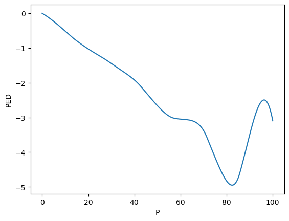
7.6. Point elasticity
The point elasticity is defined as follows.
\(E_p = \dfrac{\mathrm{d}q_i}{\mathrm{d}p_i} \dfrac{p_i}{q_i}\)
[14]:
%%time

dfun = nd.Gradient(lambda P: pq_model.predict(pd.DataFrame(P.reshape(-1,1), columns=['P'])))
slope = np.array([dfun(v) for v in pqr_df['P'].values])
pqrrs_df = pqrr_df.assign(slope=slope)
CPU times: user 10.3 s, sys: 41.9 ms, total: 10.3 s
Wall time: 10.2 s
[15]:
ped_df = pqrrs_df \
    .assign(MC=20) \
    .assign(C=lambda d: d['MC'] * d['Q']) \
    .assign(T=lambda d: d['R'] - d['C']) \
    .assign(PED=lambda d: d['slope'] * d['P'] / d['Q'])

ped_df
[15]:
| P | Q | R | MR | slope | MC | C | T | PED | |
|---|---|---|---|---|---|---|---|---|---|
| 0 | 0.0000 | 488.882022 | 50.394511 | -21.968368 | -19.861627 | 20 | 9777.640441 | -9727.245930 | -0.000000 |
| 1 | 0.1001 | 486.895001 | 94.018082 | -21.939546 | -19.838985 | 20 | 9737.900029 | -9643.881947 | -0.004079 |
| 2 | 0.2002 | 484.910265 | 137.530696 | -21.907096 | -19.815985 | 20 | 9698.205305 | -9560.674609 | -0.008181 |
| 3 | 0.3003 | 482.927849 | 180.924531 | -21.871031 | -19.792629 | 20 | 9658.556983 | -9477.632452 | -0.012308 |
| 4 | 0.4004 | 480.947789 | 224.191824 | -21.831366 | -19.768916 | 20 | 9618.955777 | -9394.763953 | -0.016458 |
| ... | ... | ... | ... | ... | ... | ... | ... | ... | ... |
| 995 | 99.5996 | 3.832953 | 477.329433 | 48.253121 | -0.114106 | 20 | 76.659067 | 400.670366 | -2.965057 |
| 996 | 99.6997 | 3.821495 | 476.776521 | 48.257495 | -0.114831 | 20 | 76.429906 | 400.346615 | -2.995857 |
| 997 | 99.7998 | 3.809963 | 476.219975 | 48.261897 | -0.115590 | 20 | 76.199260 | 400.020715 | -3.027804 |
| 998 | 99.8999 | 3.798353 | 475.659636 | 48.266329 | -0.116381 | 20 | 75.967063 | 399.692573 | -3.060914 |
| 999 | 100.0000 | 3.786662 | 475.095342 | 48.270791 | -0.117205 | 20 | 75.733249 | 399.362094 | -3.095205 |
1000 rows × 9 columns
The price with near unit elasticity is 19.12.
[16]:
ped_df.assign(diff=lambda d: np.abs(d['PED'] + 1)).sort_values(['diff']).head(1)
[16]:
| P | Q | R | MR | slope | MC | C | T | PED | diff | |
|---|---|---|---|---|---|---|---|---|---|---|
| 194 | 19.419419 | 187.437686 | 3628.303408 | 0.557074 | -9.672721 | 20 | 3748.753713 | -120.450305 | -1.002139 | 0.002139 |
The optimal prices is highly elastic; if there is a 1% increase in price, then that will lead to a 1.8% decrease in demand/quantity.
[17]:
ped_df.query(f'P == {opt_s["P"]}')
[17]:
| P | Q | R | MR | slope | MC | C | T | PED | |
|---|---|---|---|---|---|---|---|---|---|
| 386 | 38.638639 | 73.383914 | 2870.970368 | 20.016115 | -3.506521 | 20 | 1467.678282 | 1403.292086 | -1.846279 |
[18]:
 ped_df \
    .plot(kind='line', x='P', y='PED', ylabel='PED') \
    .legend().remove()
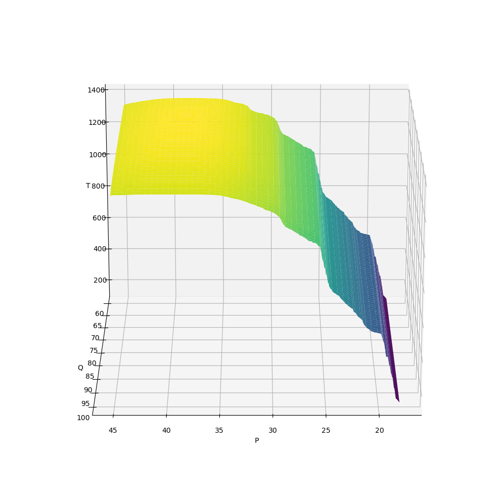
7.7. Mesh plots
Let’s look at some mesh plots for the following models.
\(T \sim f_T(P, Q)\)
\(R \sim f_R(P, Q)\)
\(R' \sim f_{R'}(P, Q)\)
\(C \sim f_C(P, Q)\)
\(E \sim f_E(P, Q)\)
[19]:
from sklearn.ensemble import RandomForestRegressor

def get_XYZ(_X, _Y, _Z):
    X = ped_df[[_X, _Y]]
    y = ped_df[_Z]

    m = RandomForestRegressor(n_jobs=-1, random_state=37).fit(X, y)

    # X = np.linspace(ped_df['P'].min(), ped_df['P'].max(), 500)
    # Y = np.linspace(ped_df['Q'].min(), ped_df['Q'].max(), 500)
    X = np.linspace(18, 45, 500)
    Y = np.linspace(60, 100, 500)

    X, Y = np.meshgrid(X, Y)
    Z = np.array([m.predict(pd.DataFrame({'P': x, 'Q': y})) for x, y in zip(X, Y)])

    return X, Y, Z
7.7.1. \(T \sim f_T(P, Q)\)
[20]:
X, Y, Z = get_XYZ('P', 'Q', 'T')
[21]:
fig = plt.figure(figsize=(10, 10))

ax = fig.add_subplot(111, projection='3d')

surf = ax.plot_surface(X, Y, Z, cmap='viridis')

ax.set_xlabel('P')
ax.set_ylabel('Q')
ax.set_zlabel('T')

ax.view_init(azim=90, elev=20)

fig.tight_layout()
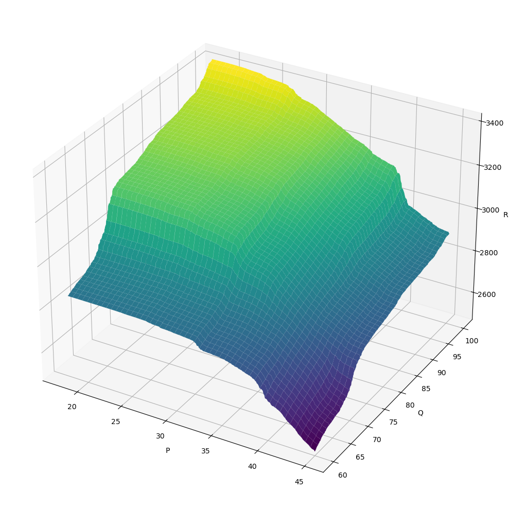
7.7.2. \(R \sim f_R(P, Q)\)
[22]:
X, Y, Z = get_XYZ('P', 'Q', 'R')
[23]:
fig = plt.figure(figsize=(10, 10))

ax = fig.add_subplot(111, projection='3d')

surf = ax.plot_surface(X, Y, Z, cmap='viridis')

ax.set_xlabel('P')
ax.set_ylabel('Q')
ax.set_zlabel('R')

fig.tight_layout()
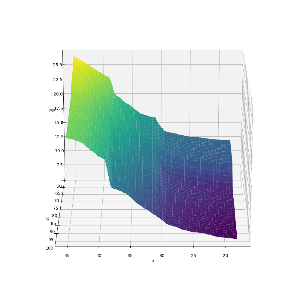
7.7.3. \(R' \sim f_{R'}(P, Q)\)
[24]:
X, Y, Z = get_XYZ('P', 'Q', 'MR')
[25]:
fig = plt.figure(figsize=(10, 10))

ax = fig.add_subplot(111, projection='3d')

surf = ax.plot_surface(X, Y, Z, cmap='viridis')

ax.set_xlabel('P')
ax.set_ylabel('Q')
ax.set_zlabel('MR')

ax.view_init(azim=90, elev=20)

fig.tight_layout()
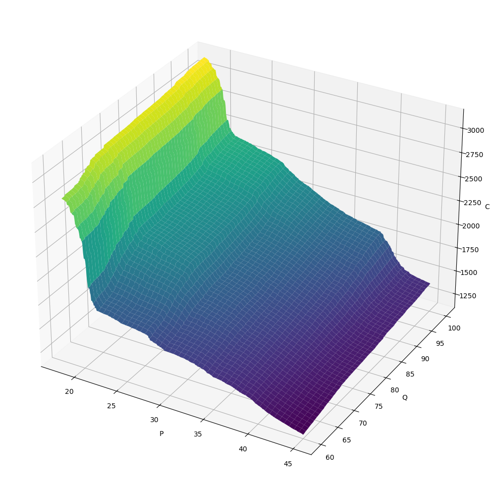
7.7.4. \(C \sim f_C(P, Q)\)
[26]:
X, Y, Z = get_XYZ('P', 'Q', 'C')
[27]:
fig = plt.figure(figsize=(10, 10))

ax = fig.add_subplot(111, projection='3d')

surf = ax.plot_surface(X, Y, Z, cmap='viridis')

ax.set_xlabel('P')
ax.set_ylabel('Q')
ax.set_zlabel('C')

fig.tight_layout()
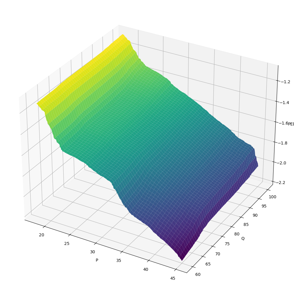
7.7.5. \(E \sim f_E(P, Q)\)
[28]:
X, Y, Z = get_XYZ('P', 'Q', 'PED')
[29]:
fig = plt.figure(figsize=(10, 10))

ax = fig.add_subplot(111, projection='3d')

surf = ax.plot_surface(X, Y, Z, cmap='viridis')

ax.set_xlabel('P')
ax.set_ylabel('Q')
ax.set_zlabel('PED')

fig.tight_layout()