4. Optimizing Marginal Revenue from the Demand Curve, Kaggle
Let’s have fun and model profit optimization using the demand curve. The data is take from Kaggle.
4.1. Load data
Let’s load the data.
[1]:
import pandas as pd
import numpy as np

df = pd.read_csv('./data/retail_price.csv') \
    .assign(
        month_year=lambda d: pd.to_datetime(d['month_year']),
        year=lambda d: d['month_year'].dt.year,
        month=lambda d: d['month_year'].dt.month,
        weekend=lambda d: d['weekday'].apply(lambda x: 1 if x >= 5 else 0),
        text=lambda d: d['product_category_name'].apply(lambda s: ' '.join(s.split('_')))
    )
df.shape
[1]:
(676, 31)
4.2. Product categories
There are 9 product categories. Let’s model 9 demand curves corresponding to each of these product categories.
[2]:
df.rename(columns={'product_category_name': 'category'}) \
    .groupby(['category', 'unit_price']) \
    .size() \
    .reset_index() \
    .groupby(['category']) \
    .size()
[2]:
category
bed_bath_table           26
computers_accessories    48
consoles_games           10
cool_stuff               18
furniture_decor          13
garden_tools             56
health_beauty            33
perfumery                14
watches_gifts            78
dtype: int64
4.3. Demand curves by category and price
Here, we shape the data by grouping records into product category and price.
[3]:
pq_df = df.groupby(['product_category_name', 'unit_price']) \
    .agg(
        q=pd.NamedAgg('qty', 'sum')
    ) \
    .reset_index() \
    .rename(columns={'unit_price': 'p', 'product_category_name': 'category'}) \
    .set_index(['category']) \
    .join(df \
        .rename(columns={'product_category_name': 'category'}) \
        .groupby(['category']) \
        .agg(c=pd.NamedAgg('freight_price', 'mean'))
    )
pq_df.shape
[3]:
(296, 3)
4.4. Optimal prices
The table below shows the optimal price for each product category.
[4]:
from sklearn.linear_model import LinearRegression

def get_mc(category):
    return pq_df[pq_df.index==category].iloc[0].c

def get_Xy(category):
    Xy = pq_df[pq_df.index==category]
    X = Xy[['p']]
    y = Xy['q']

    return X, y

def get_model(X, y):
    m = LinearRegression()
    m.fit(X, y)

    return m

def debug_params(model, mc):
    b_0, b_1 = model.intercept_, model.coef_[0]
    qp_params = f'{b_0:.5f} + {b_1:.5f}p'

    z_0, z_1 = (-b_0 / b_1), (1 / b_1)
    pq_params = f'{z_0:.5f} + {z_1:.5f}q'
    tr_params = f'{z_0:.5f}q + {z_1:.5f}q^2'

    z_0, z_1 = (-b_0 / b_1), 2 * (1 / b_1)
    mr_params = f'{z_0:.5f} + {z_1:.5f}q'

    z_0, z_1 = (-b_0 / b_1), 2 * (1 / b_1)
    qo_params = f'({mc:.5f} - {z_0:.5f}) / {z_1:.5f}'

    return {
        'q': qp_params,
        'p': pq_params,
        'tr': tr_params,
        'mr': mr_params,
        'qo': qo_params
    }

def get_params(model):
    return pd.Series([model.intercept_, model.coef_[0]], ['b_0', 'b_1'])

def get_pq(b_0, b_1):
    return lambda q: (-b_0 / b_1) + (1 / b_1) * q

def get_qp(b_0, b_1):
    return lambda p: b_0 + (b_1 * p)

def get_mr(b_0, b_1):
    return lambda q: (-b_0 / b_1) + (2 * (1 / b_1) * q)

def get_qo(b_0, b_1):
    z_0 = (-b_0 / b_1)
    z_1 = 2 * (1 / b_1)
    return lambda mc: (mc - z_0) / z_1

def get_funcs(b_0, b_1):
    pq = get_pq(b_0, b_1)
    qp = get_qp(b_0, b_1)
    mr = get_mr(b_0, b_1)
    qo = get_qo(b_0, b_1)
    r = lambda p, q: p * q
    t = lambda p, q, mc: (p * q) - (mc * q)

    return pq, qp, mr, qo, r, t

def get_opt(f, mc):
    pq_f, qp_f, mr_f, qo_f, r_f, t_f = f

    q_opt = qo_f(mc)
    p_opt = pq_f(q_opt)
    mr_opt = mr_f(q_opt)
    r_opt = r_f(p_opt, q_opt)
    t_opt = t_f(p_opt, q_opt, mc)

    return pd.Series({
        'mc': mc,
        'p': p_opt,
        'q': q_opt,
        'mr': mr_opt,
        'tr': r_opt,
        'pr': t_opt
    })

def optimize(category):
    X, y = get_Xy(category)
    m = get_model(X, y)
    p = get_params(m)
    f = get_funcs(p.b_0, p.b_1)
    mc = get_mc(category)

    return {**{'category': category}, **get_opt(f, mc).to_dict()}
The category computer_acessories is the outlier here with an optimal price recommended to be a negative price. We will see later that there is an outlier that causes this problem. The columns of the table below are as follows.
mcis marginal cost computed by taking the average cost (average freight cost of all the product items for the particular product catgeory and price point)pis the optimal priceqis the corresponding optimal quantitymris the corresponding marginal revenuetris the corresponding total revenuepris the corresponding profit
[5]:
opt_df = pd.DataFrame([optimize(c) for c in pq_df.index.unique()])
opt_df
[5]:
| category | mc | p | q | mr | tr | pr | |
|---|---|---|---|---|---|---|---|
| 0 | bed_bath_table | 16.139718 | 413.954170 | 21.954253 | 16.139718 | 9088.054630 | 8733.719184 |
| 1 | computers_accessories | 25.103741 | -27.221815 | 6.479547 | 25.103741 | -176.385023 | -339.045890 |
| 2 | consoles_games | 14.809415 | 26.068586 | 30.257496 | 14.809415 | 788.770143 | 340.674335 |
| 3 | cool_stuff | 18.975096 | 151.269261 | 24.424237 | 18.975096 | 3694.636306 | 3231.184067 |
| 4 | furniture_decor | 16.944617 | 222.175809 | 38.990538 | 16.944617 | 8662.754232 | 8002.074509 |
| 5 | garden_tools | 28.458310 | 99.268009 | 36.931818 | 28.458310 | 3666.148045 | 2615.130919 |
| 6 | health_beauty | 18.607448 | 849.975469 | 29.792779 | 18.607448 | 25323.131451 | 24768.763874 |
| 7 | perfumery | 14.336311 | 78.183209 | 30.772484 | 14.336311 | 2405.891570 | 1964.727677 |
| 8 | watches_gifts | 16.492840 | 159.459065 | 21.486980 | 16.492840 | 3426.293739 | 3071.912418 |
4.5. Visualizing optimal prices
Let’s visualize the total revenue and profit for each product category.
[6]:
import matplotlib.pyplot as plt

def plot_rev_profit_curves(category, min_p=1, max_p=800, ax=None):
    X, y = get_Xy(category)
    m = get_model(X, y)
    p = get_params(m)
    f = get_funcs(p.b_0, p.b_1)
    mc = get_mc(category)
    opt = get_opt(f, mc)

    if ax is None:
        fig, ax = plt.subplots(figsize=(7, 3))
    else:
        fig = None

    pd.DataFrame({
        'p': np.arange(min_p, max_p + 1, 1),

    }).assign(
        q=lambda d: f[1](d['p']),
        tr=lambda d: d['p'] * d['q'],
        mr=lambda d: f[2](d['q']),
        pr=lambda d: f[5](d['p'], d['q'], mc)
    ) \
    .set_index(['p'])[['tr', 'pr']] \
    .plot(kind='line', ax=ax)

    ax.axvline(x=opt.p, color='r', alpha=0.5, linestyle='dotted')
    ax.legend(bbox_to_anchor=(1.1, 1.05))
    ax.set_title(f'{category}, p_opt=${opt.p:.2f}')
    ax.set_ylabel('USD')

    if fig is not None:
        fig.tight_layout()
[7]:
fig, axes = plt.subplots(4, 2, figsize=(10, 7))

categories = [
    'bed_bath_table', 'consoles_games', 'cool_stuff', 'furniture_decor',
    'garden_tools', 'health_beauty', 'perfumery', 'watches_gifts'
]
min_p = [
    300, 1, 50, 50,
    1, 750, 1, 100
]
max_p = [
    550, 50, 300, 400,
    200, 1_000, 150, 250
]

for c, _min_p, _max_p, ax in zip(categories, min_p, max_p, np.ravel(axes)):
    plot_rev_profit_curves(c, min_p=_min_p, max_p=_max_p, ax=ax)

fig.tight_layout()
4.6. Computer accessories
Now, what’s wrong with the computers_accesories category? Notice that its total revenue and profit curves are convex (and not concave).
[8]:
plot_rev_profit_curves('computers_accessories', min_p=-100, max_p=100)
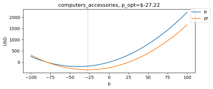
Let’s dig a big deeper.
[9]:
category = 'computers_accessories'
X, y = get_Xy(category)
m = get_model(X, y)
p = get_params(m)
f = get_funcs(p.b_0, p.b_1)
mc = get_mc(category)
opt = get_opt(f, mc)
[10]:
opt
[10]:
mc     25.103741
p     -27.221815
q       6.479547
mr     25.103741
tr   -176.385023
pr   -339.045890
dtype: float64
Look at the relationships below. You will notice that the slopes of q and p are NOT negative but positive (that explains the convex curves).
[11]:
debug_params(m, mc)
[11]:
{'q': '9.85046 + 0.12383p',
 'p': '-79.54737 + 8.07550q',
 'tr': '-79.54737q + 8.07550q^2',
 'mr': '-79.54737 + 16.15099q',
 'qo': '(25.10374 - -79.54737) / 16.15099'}
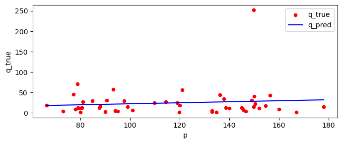
If we visually inspect the data (red dots are scatter plot of true quantity), we notice an outlier quantity around 250. The predicted curve from this data slopes up (positive slope, blue line).
[12]:
fig, ax = plt.subplots(figsize=(7, 3))

_temp = pq_df[pq_df.index==category] \
    .assign(
        q_true=lambda d: d['q'],
        q_pred=lambda d: f[1](d['p'])
    )[['p', 'q_true', 'q_pred']]

_temp.plot(kind='scatter', x='p', y='q_true', label='q_true', ax=ax, color='r')
_temp.plot(kind='line', x='p', y='q_pred', label='q_pred', ax=ax, color='b')

fig.tight_layout()
/opt/anaconda3/lib/python3.9/site-packages/pandas/plotting/_matplotlib/core.py:1114: UserWarning: No data for colormapping provided via 'c'. Parameters 'cmap' will be ignored
  scatter = ax.scatter(
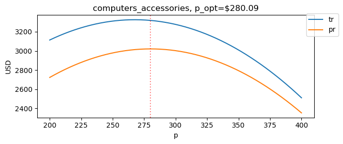
4.7. Remove outlier
Let’s simply remove the outlier and see what happens.
[13]:
Xy = pq_df[pq_df.index==category].query('q < 252')
X = Xy[['p']]
y = Xy['q']

m = get_model(X, y)
p = get_params(m)
f = get_funcs(p.b_0, p.b_1)
mc = get_mc(category)
opt = get_opt(f, mc)
[14]:
opt
[14]:
mc      25.103741
p      280.092646
q       11.847662
mr      25.103741
tr    3318.442913
pr    3021.022281
dtype: float64
The relationships look better (slopes are negative).
[15]:
debug_params(m, mc)
[15]:
{'q': '24.86173 + -0.04646p',
 'p': '535.08155 + -21.52230q',
 'tr': '535.08155q + -21.52230q^2',
 'mr': '535.08155 + -43.04460q',
 'qo': '(25.10374 - 535.08155) / -43.04460'}
The total revenue and profit curves are now concave.
[16]:
min_p, max_p = 200, 400

fig, ax = plt.subplots(figsize=(7, 3))

pd.DataFrame({
    'p': np.arange(min_p, max_p + 1, 1),

}).assign(
    q=lambda d: f[1](d['p']),
    tr=lambda d: d['p'] * d['q'],
    mr=lambda d: f[2](d['q']),
    pr=lambda d: f[5](d['p'], d['q'], mc)
) \
.set_index(['p'])[['tr', 'pr']] \
.plot(kind='line', ax=ax)

ax.axvline(x=opt.p, color='r', alpha=0.5, linestyle='dotted')
ax.legend(bbox_to_anchor=(1.1, 1.05))
ax.set_title(f'{category}, p_opt=${opt.p:.2f}')
ax.set_ylabel('USD')

fig.tight_layout()